Three modes of working to design a Value Proposition

The Value Proposition Canvas is a visual tool that you can use to model concepts and ideas of how the product or service you are creating may add value to the lives of your customers. It helps to quickly create alignment within a team and with stakeholders, brainstorm, compare and explore alternative paths of thinking and assess the current state of your product discovery initiative. It is designed like grammar that you can use to formulate your value proposition.
The Value Proposition Canvas at the #PoDojo

At the #PoDojo we have been using the Value Proposition Canvas in different contexts, for example, like designing a training program within a larger digital transformation, sketching out game ideas in the early game prototyping phase, and as a scorecard in several Design Thinking solution focused workshops with our customers. In our #PoDojo trainings we used it to create pitches of new product or service ideas, and during a lean change initiative we use this to create a shared picture of pains, gains and jobs to be done that need to be addressed by organisational redesign.
Design and observe
The minimalistic structure of a square for the Value Proposition Map and a circle for the Customer Segment Profile makes the tool applicable in multiple contexts. Nevertheless the application of the visual structure can be perplexing when using it the first time and may require some practice. Particularly using both sides of the canvas in a single flow, e.g. in a workshop setup just working with the canvas alone will likely lead to a consistent picture indicating a strong FIT of the value proposition and customer segment. Using the canvas in this way makes it easy to miss the difference in the practices of DESIGN and OBSERVE.
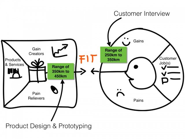
People get puzzled by the redundancy they find when filling in the different fields of the canvas. E.g. when using the example of electric car manufacturer Tesla formulating a Gain Creator/Pain Reliever of “Range of 350km to 450km” in the Value Proposition Map for a Gain described as “Range of 250km to 350km” on the Segment Profile. This sounds trivial when it is not clear that the Gain is found by observing customers while the Gain Creator is the outcome of a design process and finding a FIT means that your design meets a real need or solves a real problem of your customer. It is nothing wrong in creating a consistent picture or story of your product yet constructing the FIT of both sides in a vacuum without validating by observing customers, designing solutions and testing your ideas outside of your building may result in a consistent idea that no one cares about.
Three modes of working
Observing customers, designing value propositions for your products or services, and working conceptually using the canvas require three different modes of working. The activities of DESIGNING that are the domain of the square are essentially different from the activities of OBSERVING that are covered by the circle. To gather customer insights you need to go outside of the building and to come up with a good design you need to ideate, prototype and create artefacts. If you practice both, the canvas is then very useful for strategic planning, visualizing and synthesizing outcomes of both activities. It helps in your strategic planning to express where you are in the messy process of product discovery - but don’t confuse the map with the landscape.
This may sound trivial but we have seen so many groups using the trigger questions to fill out the canvas just as a colour by numbers exercise and then go back to work as usual. It’s easy then to take what’s on the canvas for granted and to miss the connection to the hard work of gathering customer insights and designing a product’s value proposition. People hate uncertainty and a simplistic story that is making sense can become very attractive and lead your product discovery team into the wrong direction unless they create evidence for what they express on the canvas.
There is no good or bad
So setting the context and framing the task as strategic work when using the canvas with a team is crucial. We still found it useful to fill out the complete canvas and mapping a customer segment profile to sketch out the starting point for a Design Thinking project before any observations happened but then we needed to continuously refine the customer segment profile while gathering customer insights. As with any language, there are no good or bad uses as long as you are aware what you want to express and in which context it makes sense. Are you describing the status quo, brainstorming a new idea, describing a potential value proposition that may fit what you have observed spending time with your customers? To bridge the semantic gap, you need to test what’s on the canvas, which will be covered in a next post on Value Proposition Design.
If you want to use the Value Proposition Canvas here are some links to get you started:
Value Proposition Canvas explained
Businessmodellgeneration canvas
Value Proposition Design by Strategyzer
Strategyzer Webinar: How to use the Value Proposition Canvas